Curry Crown: Turning restaurant creatives into a local craving system
Restaurant social content system built around food cravings, festive moments, offers, and dine-in recall.
Problem
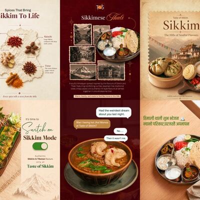
The restaurant had food, ambience, and festive moments to communicate, but the visuals needed to make people stop, understand the occasion quickly, and feel a craving. The challenge was not only to show dishes, but to package food, celebration, and local restaurant energy into a repeatable content system.
Objective
- Build stronger appetite appeal in the first 2 seconds.
- Create a premium but warm restaurant feel.
- Make festive and occasion-led posts usable for Instagram.
- Design creatives that support walk-ins, offers, and brand recall.
Strategic Insight
People do not respond to restaurant posts only because a dish is visible. They respond to cravings, occasions, memories, and social moments. The design system therefore needed to sell the feeling around the food, not just the food image.
Creative Direction
- Warm, rich food photography and deep green/gold accents for a premium dining mood.
- Short first-glance copy so the user understands the post without reading a caption.
- Grid layouts balancing food close-ups, ambience, and campaign-led typography.
- Festive language and local-cultural cues to make the brand feel timely and relevant.
Final Output
- Festival-led food creatives
- Food-grid social posts
- Chef / brand moment posts
- Craving-led captions and layout hierarchy
Honest Impact
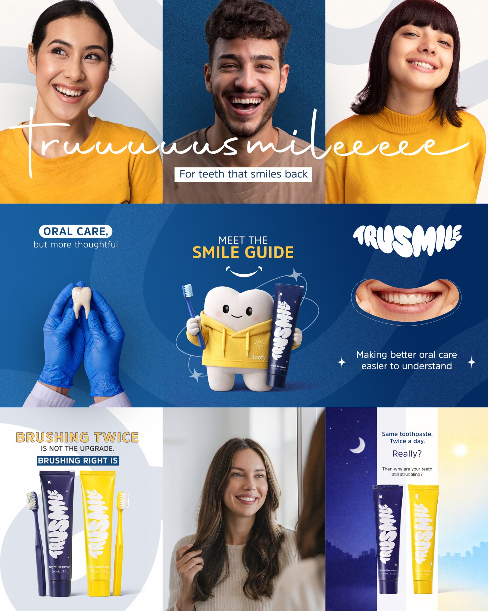
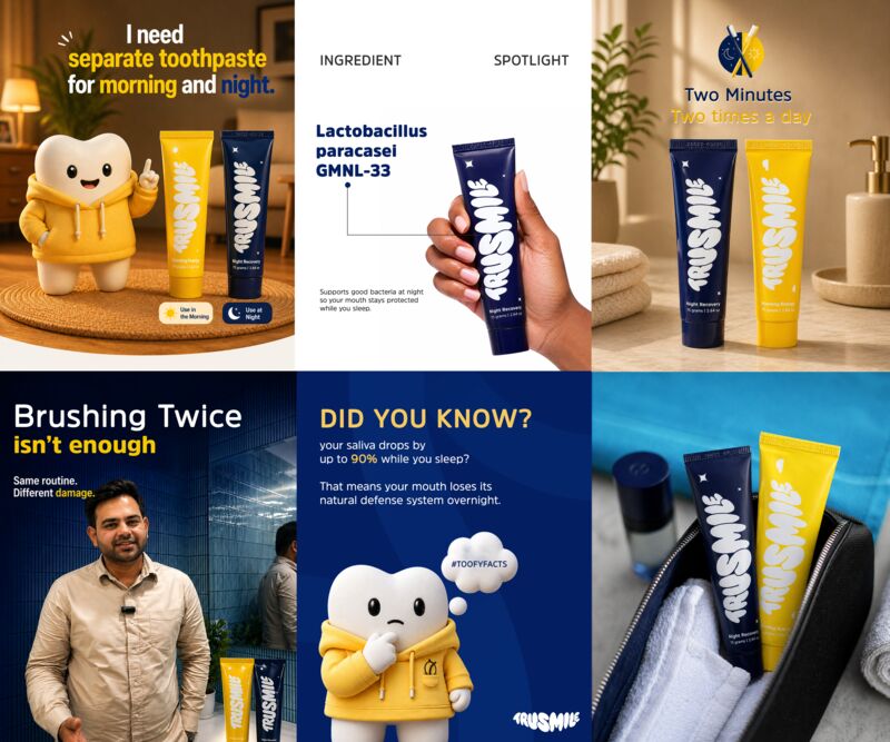
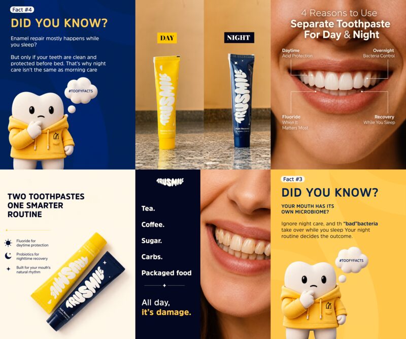
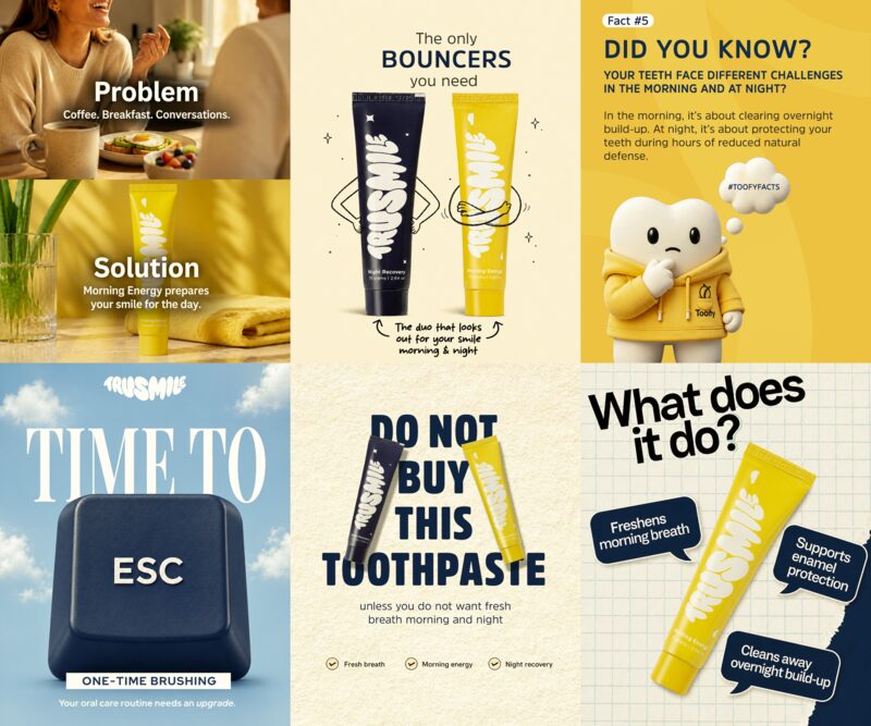
Trusmile: Building a playful AM/PM oral care visual system
A D2C toothpaste brand system using friendly product storytelling, AM/PM contrast, mascot energy, and clean oral-care cues.
Problem
Oral care products can easily look clinical and boring. Trusmile needed a visual system that could explain product benefits while still feeling friendly, memorable, and social-media friendly.
Objective
- Create a recognisable AM/PM toothpaste world.
- Make product education feel light and easy.
- Use characters, real faces, and product close-ups to improve recall.
- Create posts that work as a feed system, not one-off designs.
Strategic Insight
For oral care, trust and habit-building matter. A playful but clean system makes the product feel approachable while still communicating hygiene, routine, and benefit.
Creative Direction
- Blue/yellow contrast to separate morning and night cues.
- Mascot-led storytelling to make the brand memorable.
- Large product placement with simple benefit-led copy.
- A mix of lifestyle faces, product-only posts, and educational carousels.
Final Output
Honest Impact
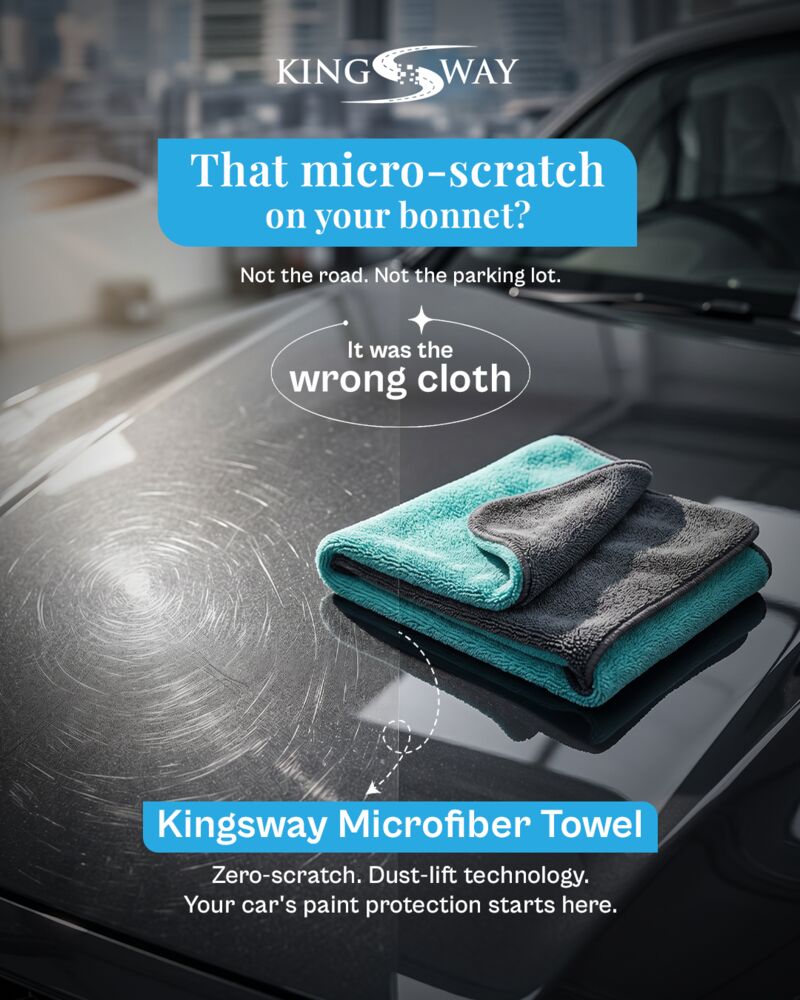
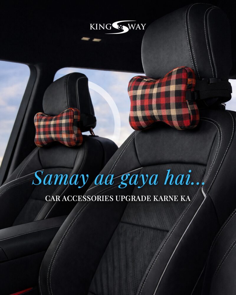
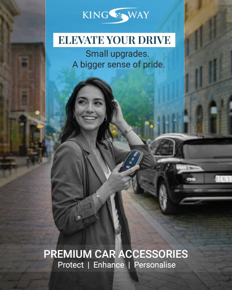
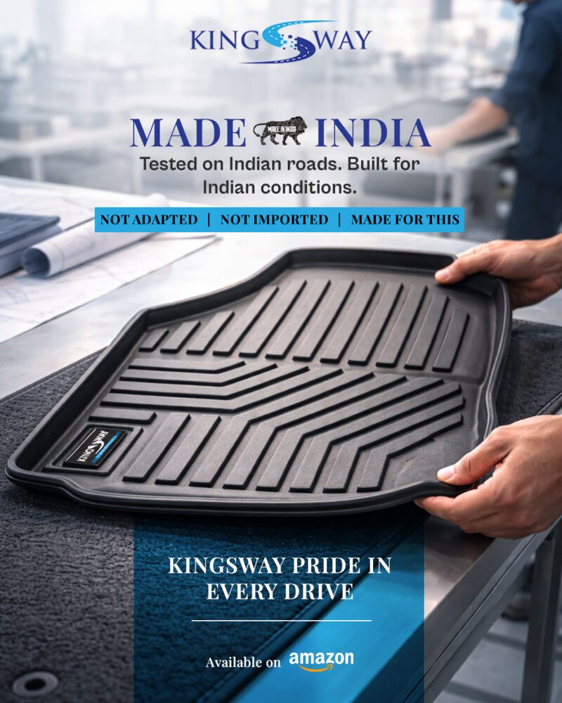
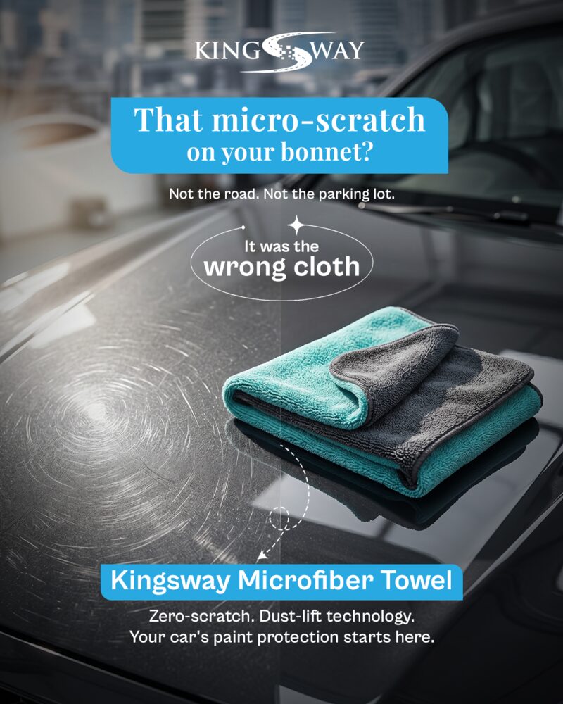
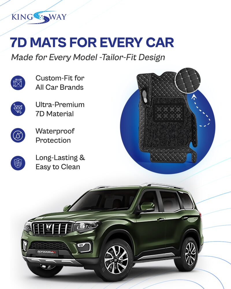
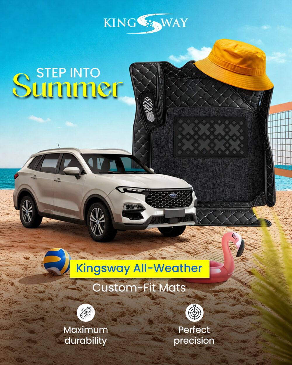
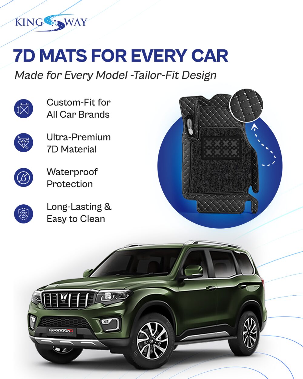
Kingsway: Product-led ad creatives for automotive accessories
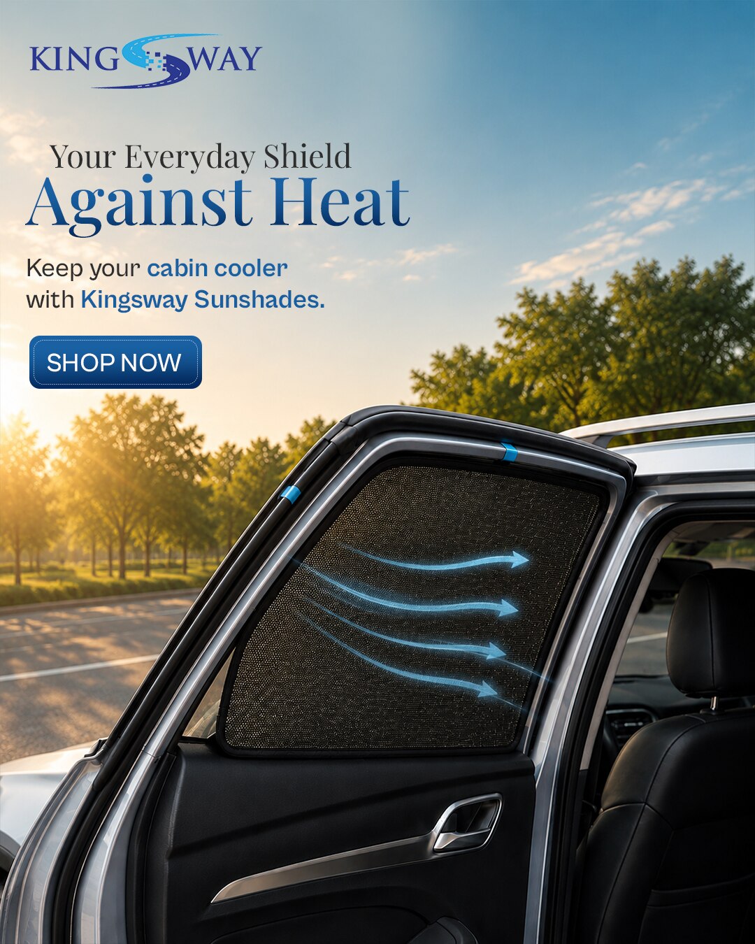
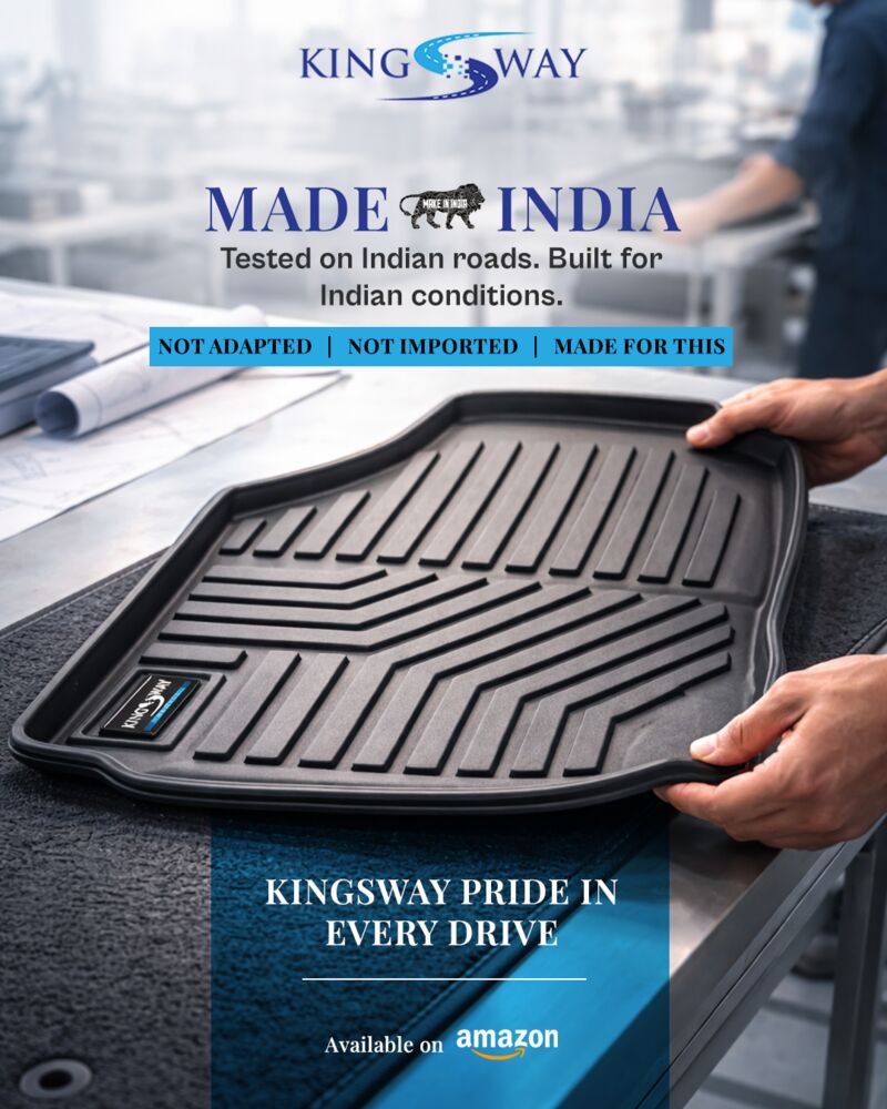
Amazon-ready product creatives for mats, sunshades, microfiber towels, and comfort accessories with clear feature-first hierarchy.
Problem
Car accessories require instant clarity. A customer needs to understand the product, use case, benefit, and purchase context quickly. The design challenge was to make functional products look desirable without losing information.
Objective
- Communicate product utility in a clear first-glance layout.
- Create sharper Amazon / e-commerce product creatives.
- Show benefits such as waterproof, easy wash, long-lasting, heat & scratch protection.
- Give each product its own scenario while keeping brand recall consistent.
Strategic Insight
For utility products, the strongest creative is not the most decorative one it's the one that makes the product use-case obvious and believable in one glance.
Creative Direction
- Bold product-first layouts with car context backgrounds.
- Feature icons and short benefit copy for quick scanning.
- Rugged road, heat, and protection scenes to explain use cases.
- Brand logo placement and consistent product framing across posts.
Final Output


Honest Impact
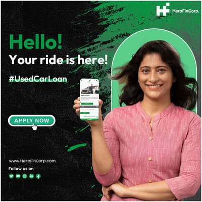
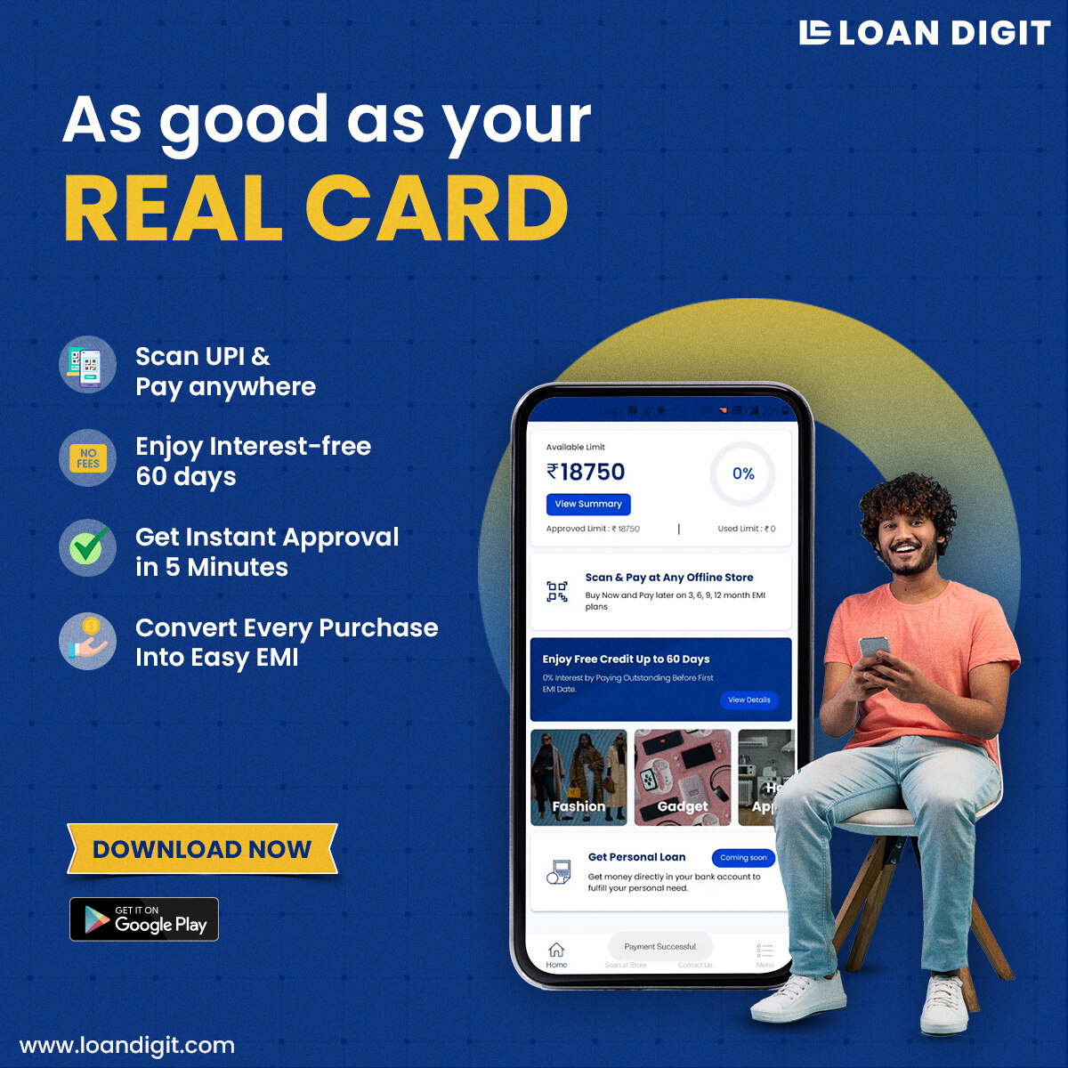
LoanDigit: Turning credit features into simple performance creatives
Fintech app creatives communicating UPI credit, pay-later, EMI, instant approval, and interest-free benefits with a clear CTA flow.
Problem
Credit and EMI products can become text-heavy and confusing. LoanDigit needed creatives that could translate financial features into simple everyday-life benefits like shopping, repayment flexibility, UPI scanning, and pay-later convenience.
Objective
- Make fintech benefits easy to understand.
- Use lifestyle scenarios to reduce financial-product complexity.
- Keep app download CTA prominent.
- Build multiple campaign variations around one clear product promise.
Strategic Insight
A fintech ad works better when the user first sees the life moment shopping, repayment, payment at QR and then sees the finance feature that helps them.
Creative Direction
- Blue/yellow brand colour system for trust and energy.
- Phone mockups to make the app feel tangible.
- Lifestyle characters to show everyday use cases.
- Short, benefit-first headlines with app-store CTA blocks.
Final Output


Honest Impact
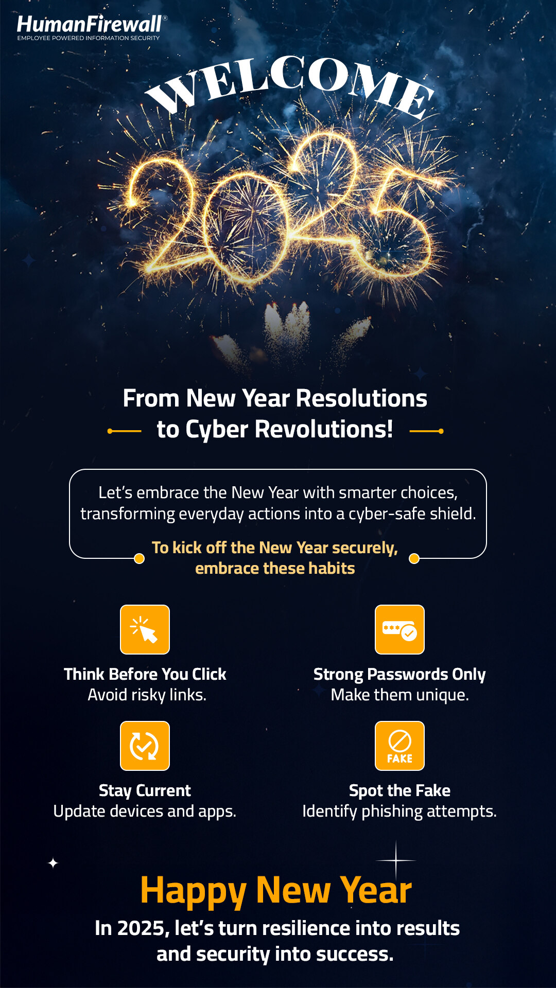
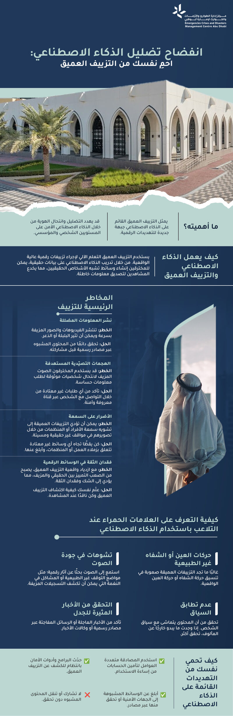
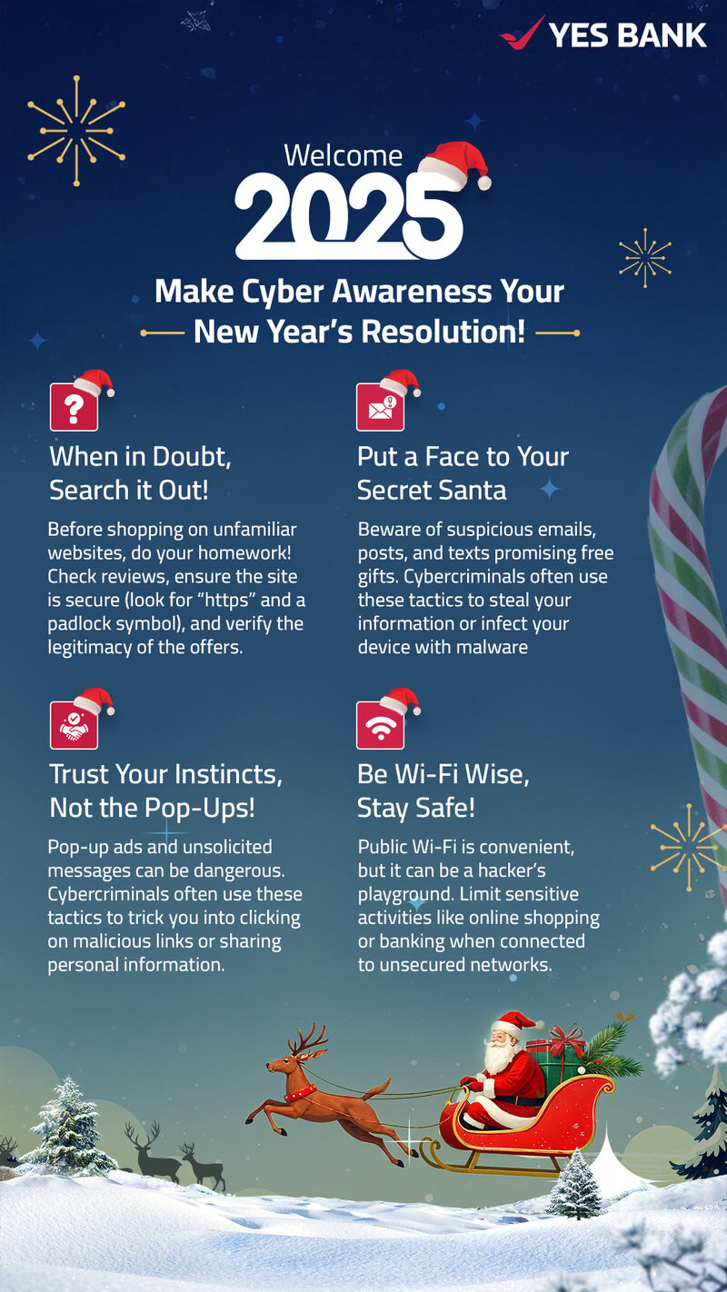
Cybersecurity Emailers: Making security awareness readable and engaging
B2B cyber-awareness emailers for topics like deepfakes, drive-by downloads, clean desk habits, and New Year security resolutions.
Problem
Cybersecurity topics are important but often ignored because they look technical or text-heavy. The design challenge was to make serious risk topics easy to understand while keeping the communication credible for corporate audiences.
Objective
- Make complex cyber topics scannable and memorable.
- Create designs that work inside inbox and internal communication channels.
- Balance seriousness with visual engagement.
- Use hierarchy, icons, and examples to improve readability.
Strategic Insight
Security communication is most effective when it turns abstract risk into simple habits: what can go wrong, what to avoid, and what action to take next.
Creative Direction
- Strong headline-first layout for fast topic recognition.
- Visual themes matched to each risk: deepfake, "Digital Hogwarts", New Year, clean desk, download threat.
- Icon-led tips and short copy chunks for easier reading.
- Corporate trust cues through clean spacing and structured sections.
Final Output
Honest Impact
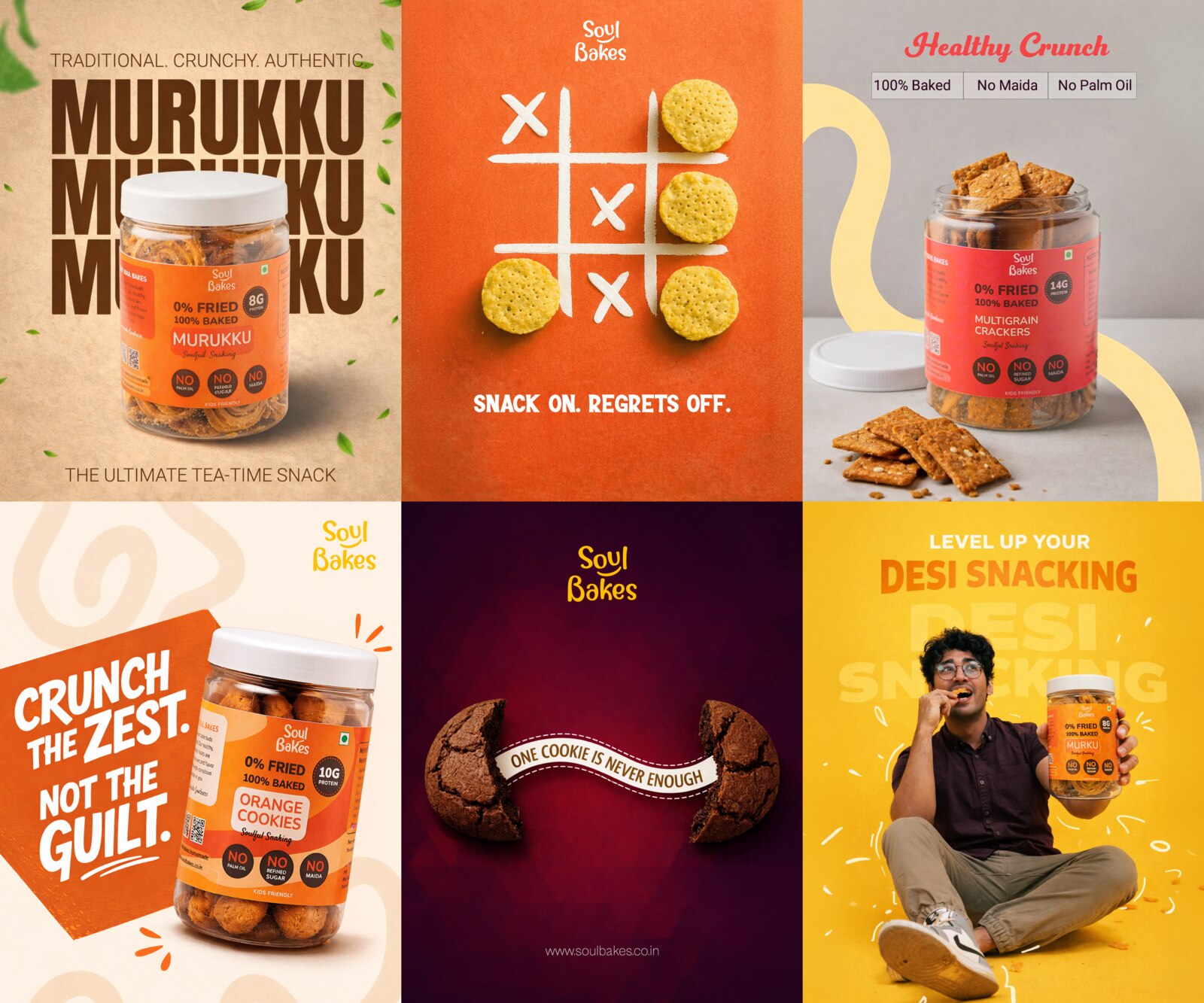
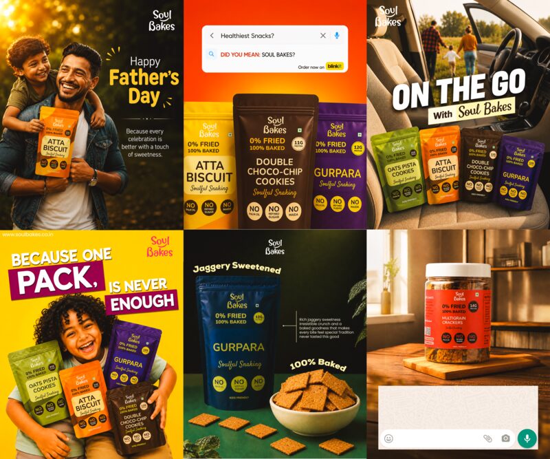
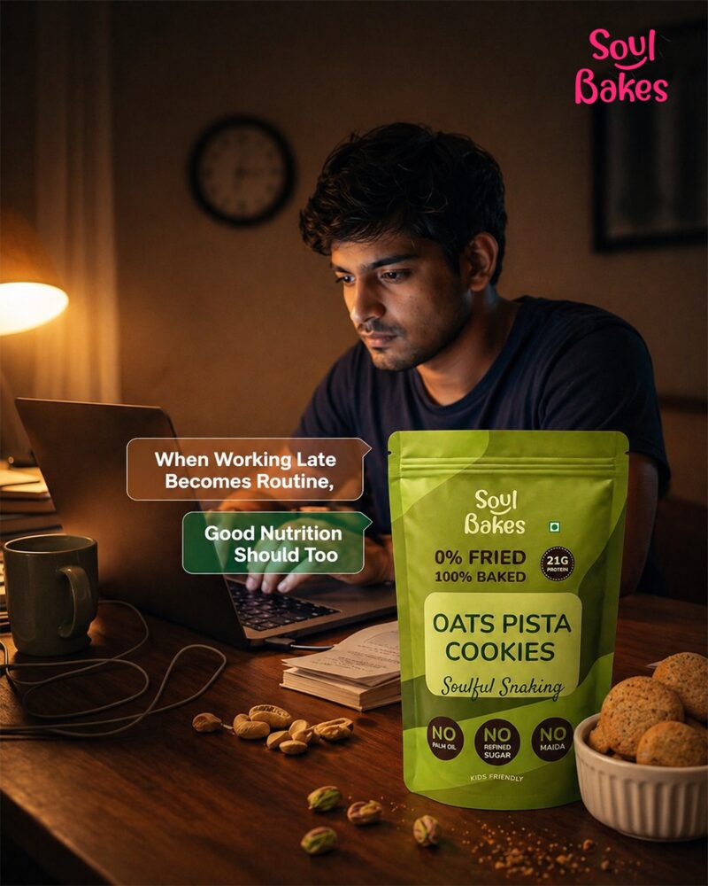
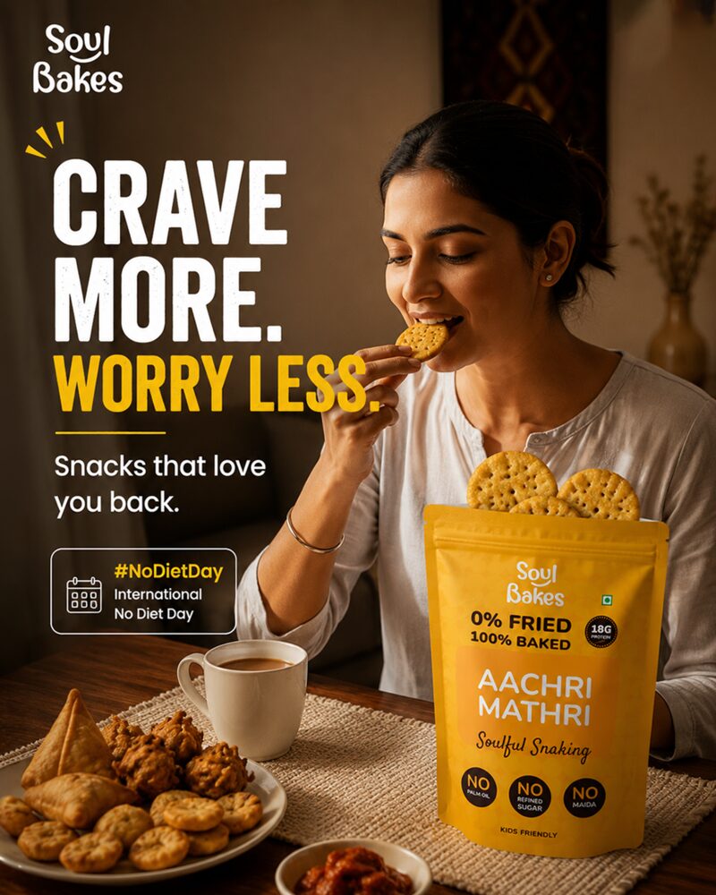
Soul Bakes: Snack-brand creatives built around taste, guilt-free cues & recall
Bright FMCG-style social grid for cookies and snacks using product pack shots, playful copy, appetite cues, and health-benefit callouts.
Problem
Snack brands need high appetite appeal, but also need to communicate health or guilt-free benefits quickly. The design challenge was to make the product look craveable while keeping the brand message clear.
Objective
- Build a colourful and energetic snack-brand grid.
- Highlight product packs clearly.
- Communicate benefits like protein / no maida / no palm oil where present.
- Use short playful lines that feel social-first.
Strategic Insight
Food product creatives work best when they create a quick sensory hook first, then support it with product details and benefit cues.
Creative Direction
- Warm orange/yellow palette for snack energy.
- Pack-shot-first layouts for product recall.
- Playful copy such as "guilt-free", "crunch", "snacking" cues.
- Combination of flat-lay, product hero, and human-lifestyle compositions.
Final Output
- Murukku product creative
- "Snack on, regrets off" engagement post
- Healthy crunch product post
- Cookie / product-benefit creative
- Lifestyle snacking visual